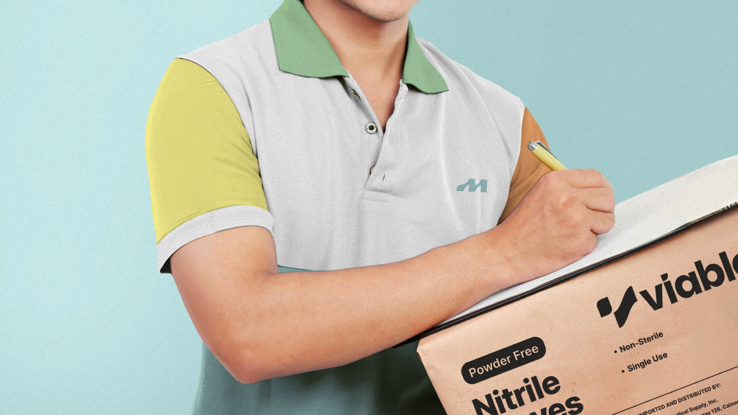
Keeping you and your patients safe since 2008.
E.Mendez Medical is a trusted of supplier of medical supplies both in the Philippines and abroad.
They pride themselves in delivering prompt results to meet the fast-paced demands of the medical industry.
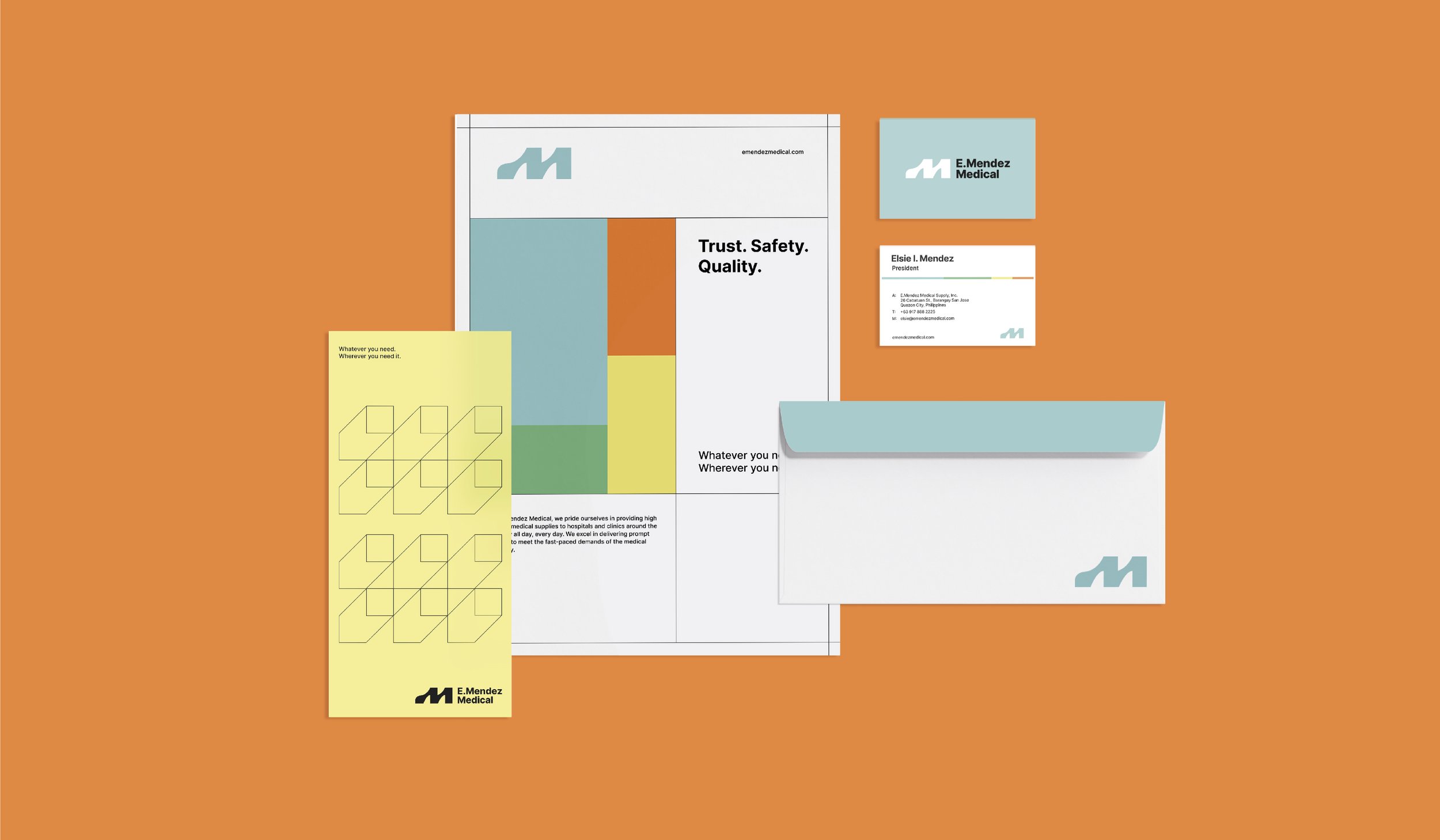
Agape created the brand identity, packaging and web design for E.Mendez Medical.
Whenever we would visit clinics and hospitals, we often noticed the design of medical supplies, including their packaging. These designs frequently fell short in both aesthetics and practicality, featuring excessive text and cluttered graphics, which would make it challenging to quickly identify items in emergency situations.
Our goal was to establish a visual identity for E.Mendez that enhances its products both aesthetically and in terms of practical usability.
Also, we want to ensure that the branding is atypical to other medical supplies companies, one that Doctors would be proud to have in their clinics and proudly display in their shelves.
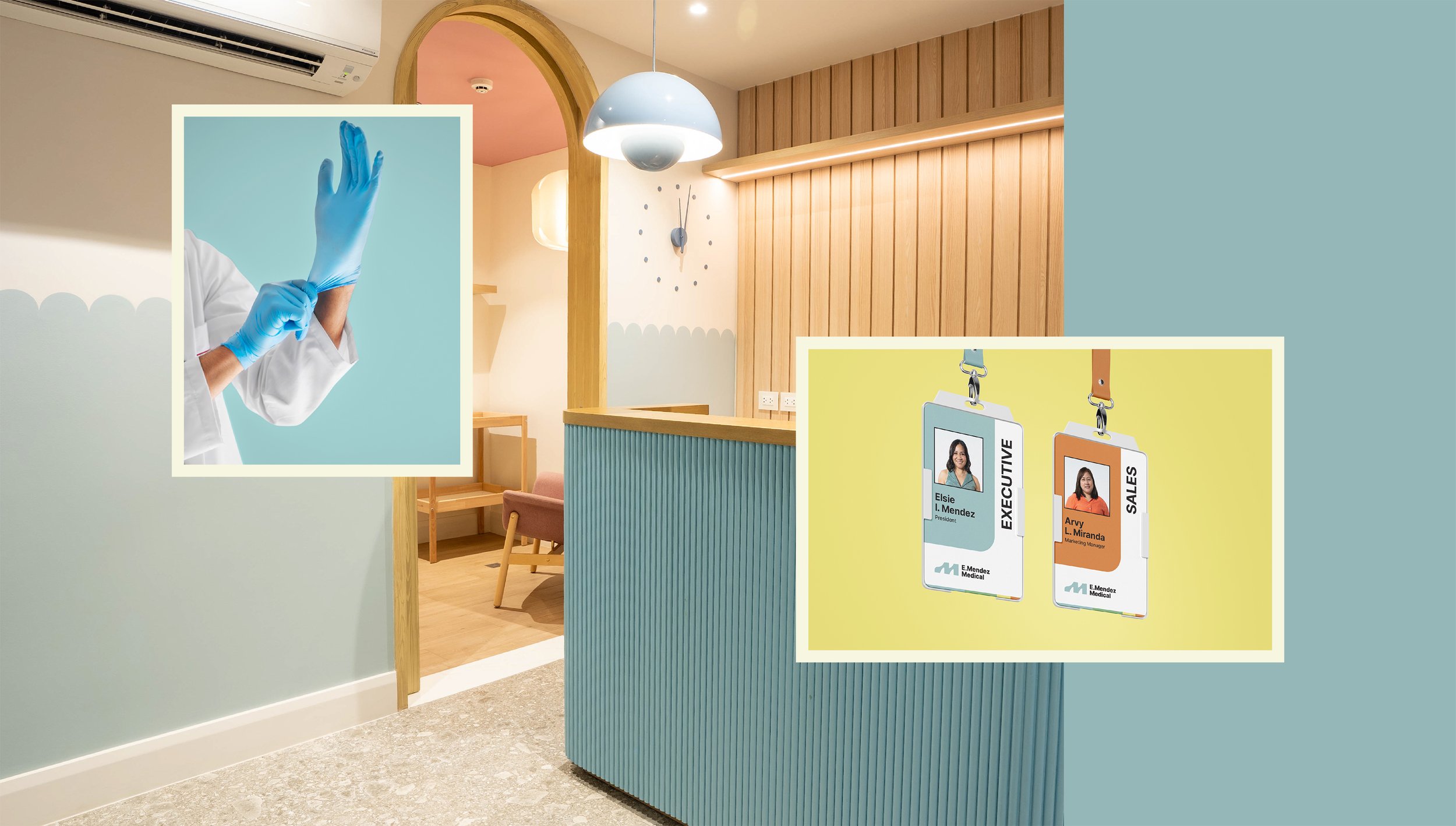

Trustworthy. Approachable. Familiar.
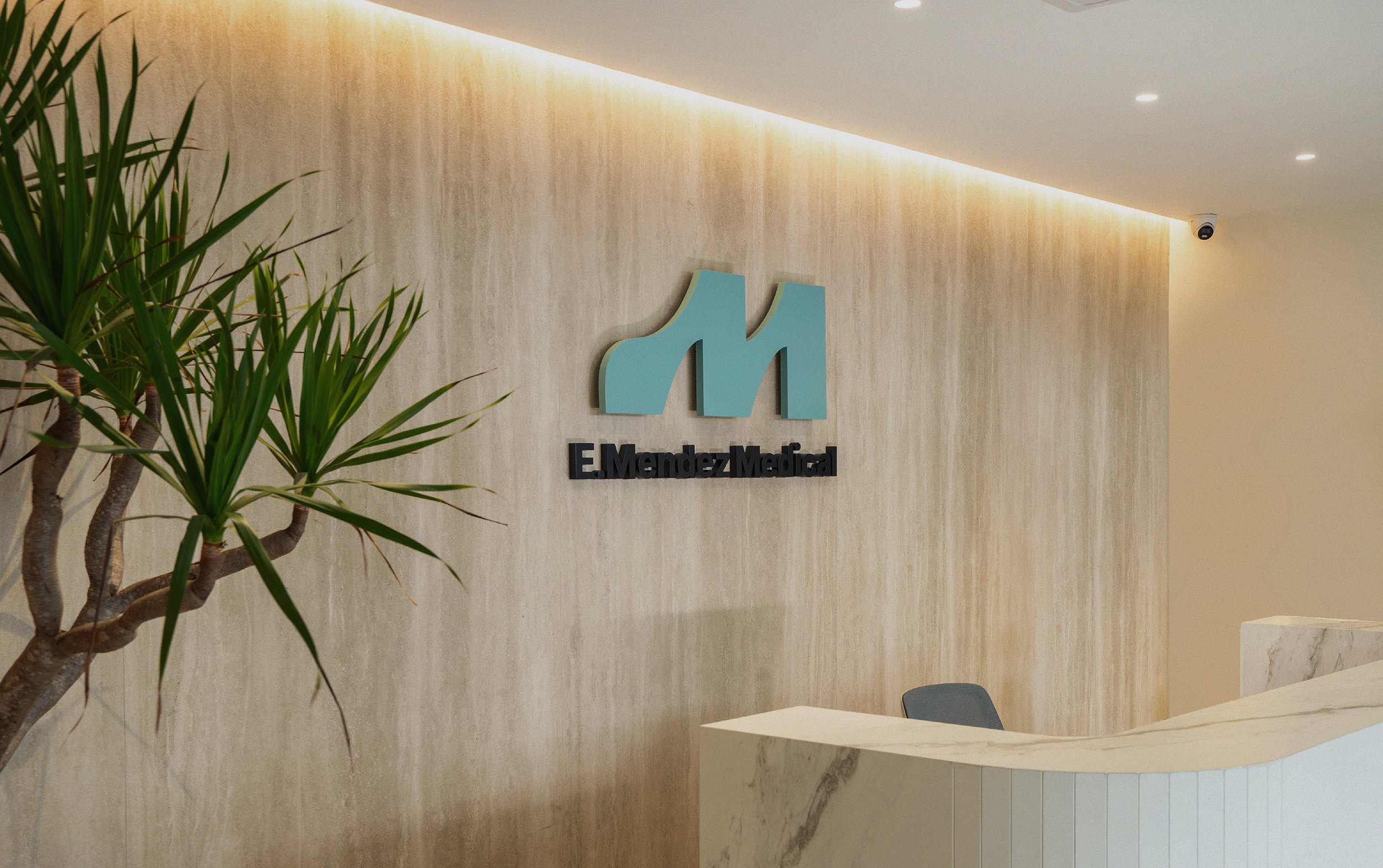
We aimed for the logo to be clear and straightforward. We chose a modernist symbol that is easily recognizable yet distinctive enough to be memorable and stand out.
With most medical companies opting for your typical blue or teal color palette, we made it a point to differentiate E.Mendez by featuring a wide selection of colors including teal, green, orange and yellow.

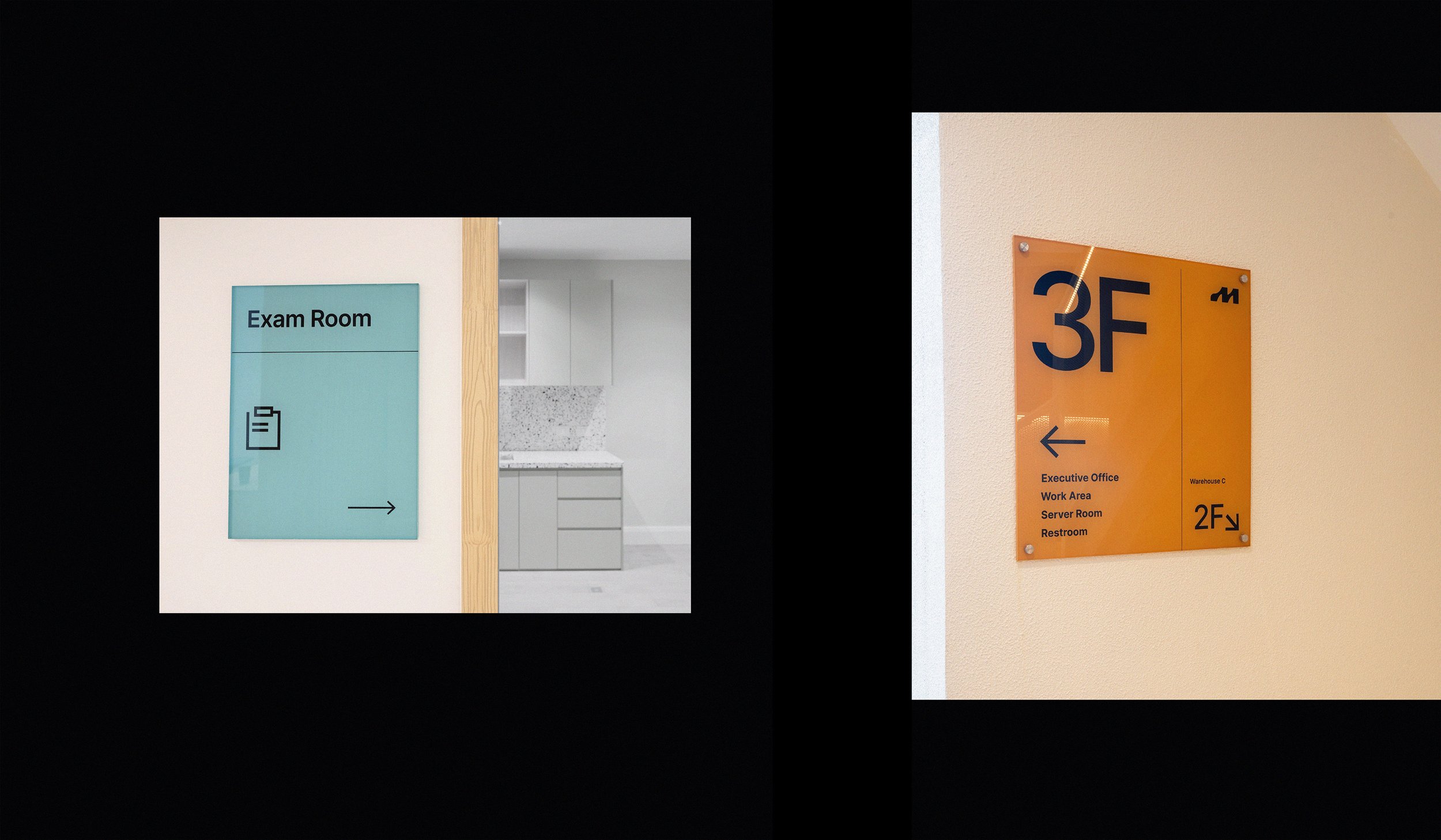

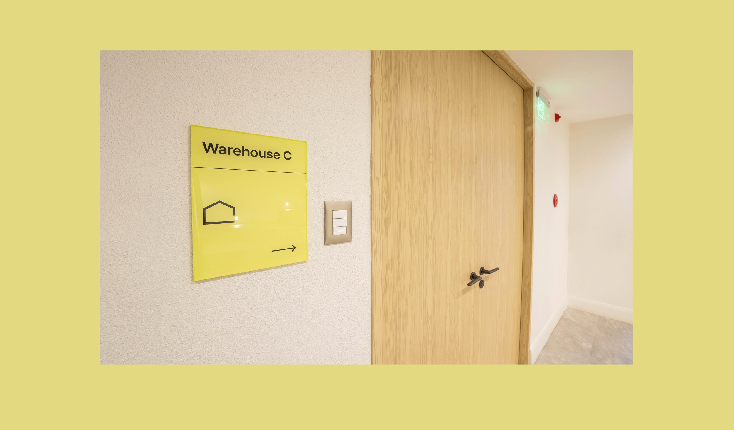
The color palette also serves a practical purpose in terms of E.Mendez’s identity system and was used to differentiate the company’s departments, product offerings, brands, and even the wayfinding for their building.


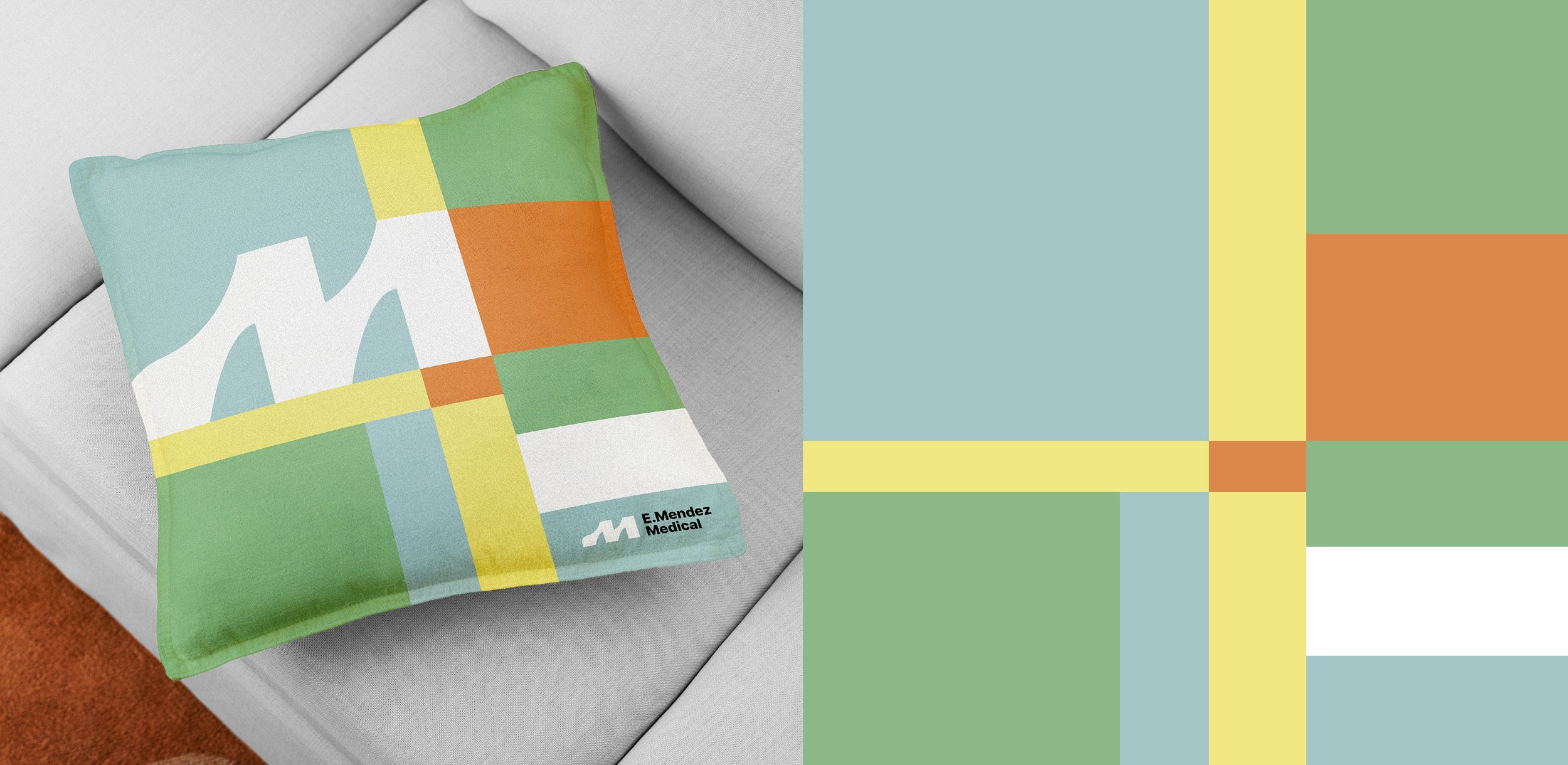
In line with the simple modernist look of the logo, we created patterns that serve as key visuals for the brand identity. This gives E.Mendez unique identifiable element that connect with the logo and colors, helping establish the company’s visual identity.
For more information visit emendezmedical.com
Photography by JCMedia


